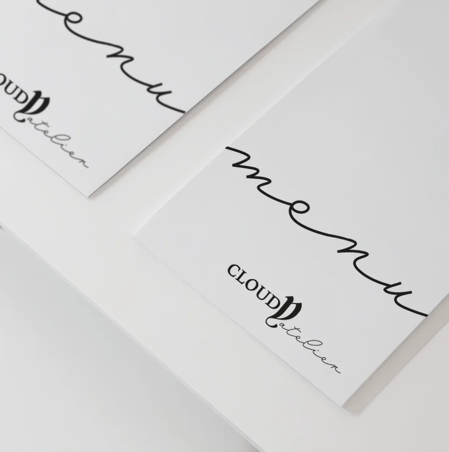
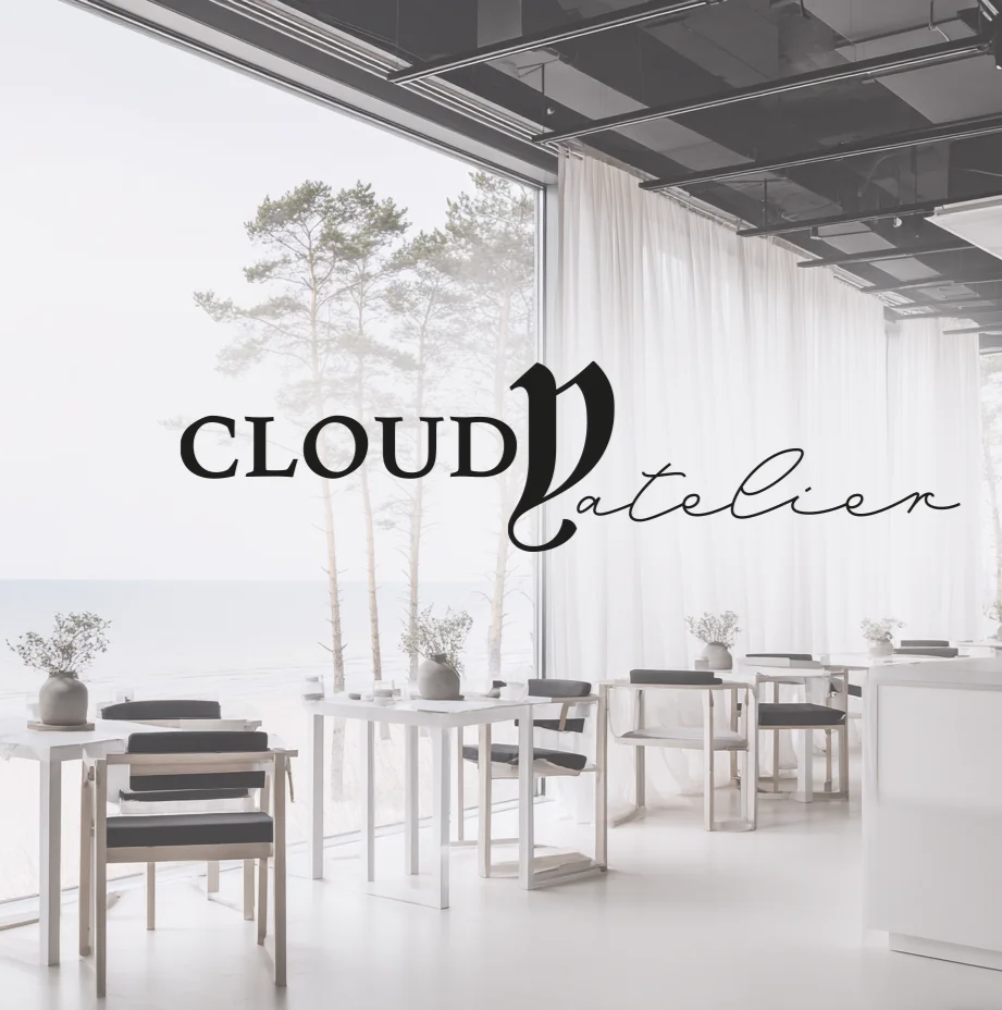
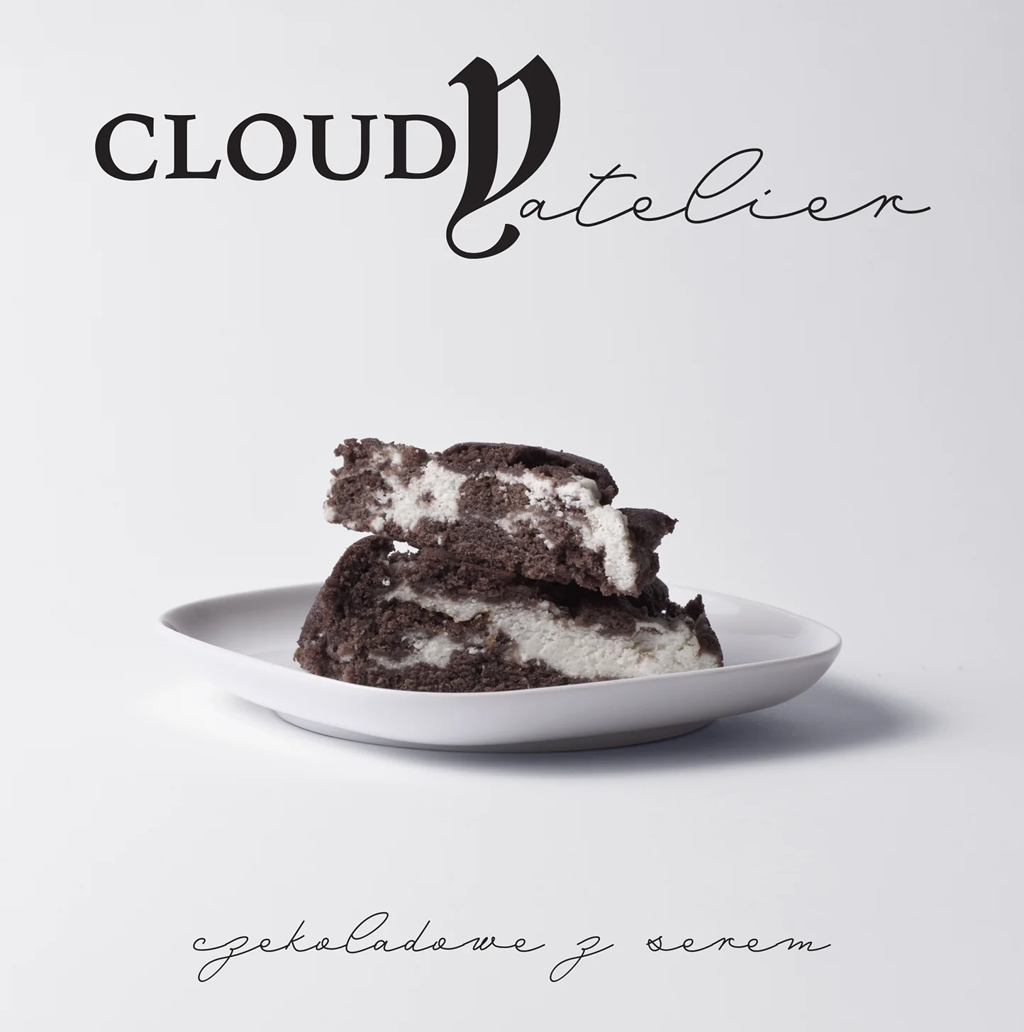
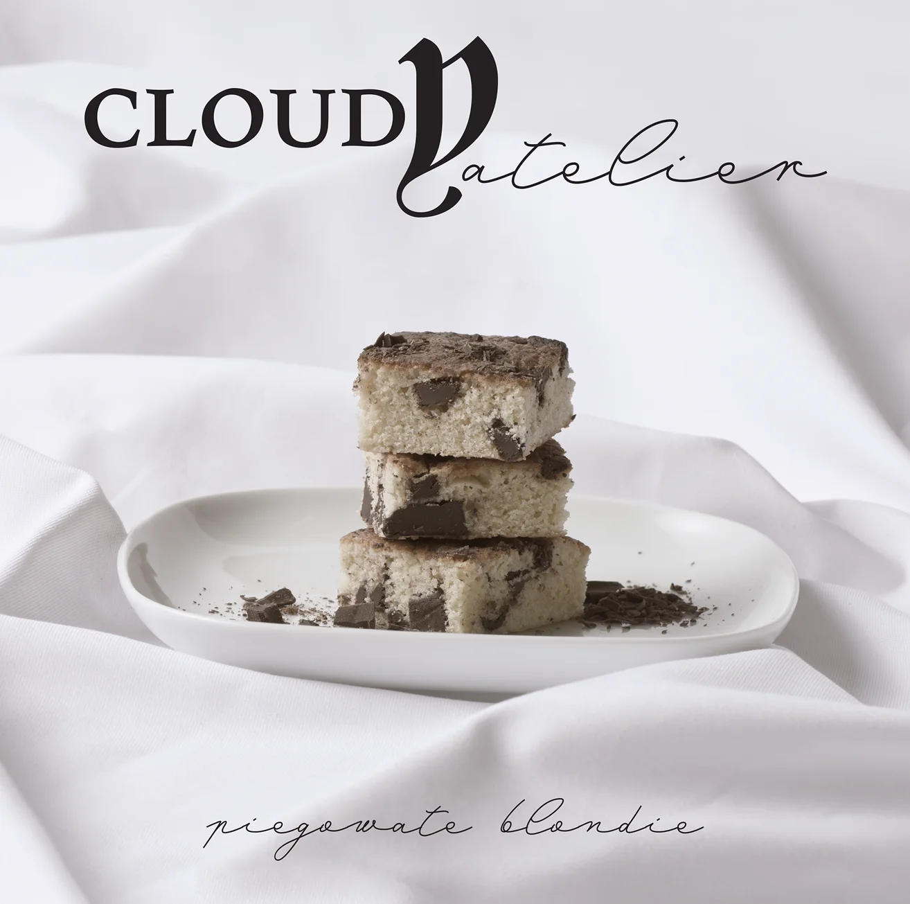
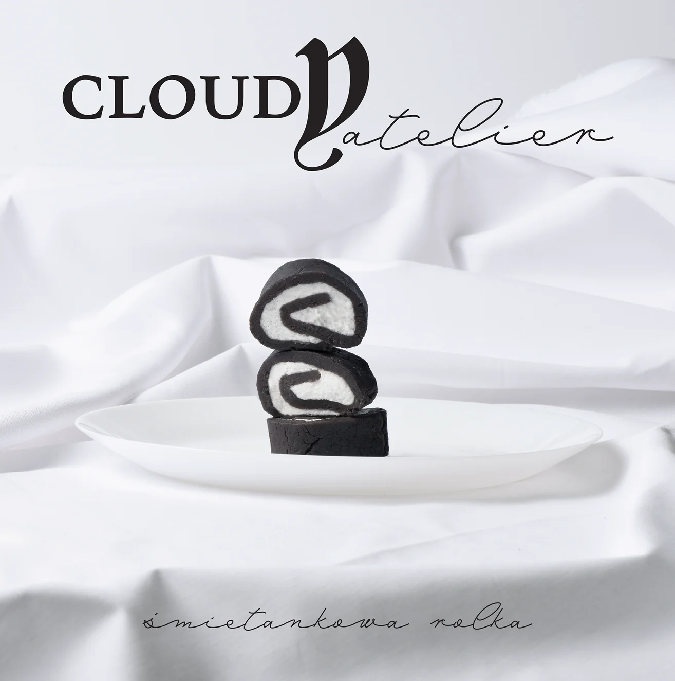
CLOUDY atelier concept
BRAND DESIGN / PHOTOGRAPHY
PL
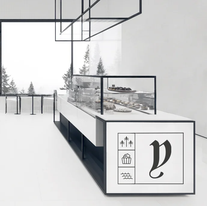
Koncept ekskluzywnej kawiarni
Koncept ekskluzywnej kawiarni wraz z pracownią cukierniczą położoną nad urokliwym, piaszczystym wybrzeżem oddalonym od ścisłego centrum.


PL
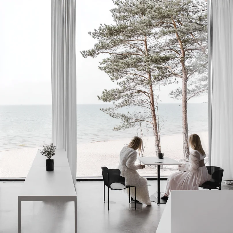
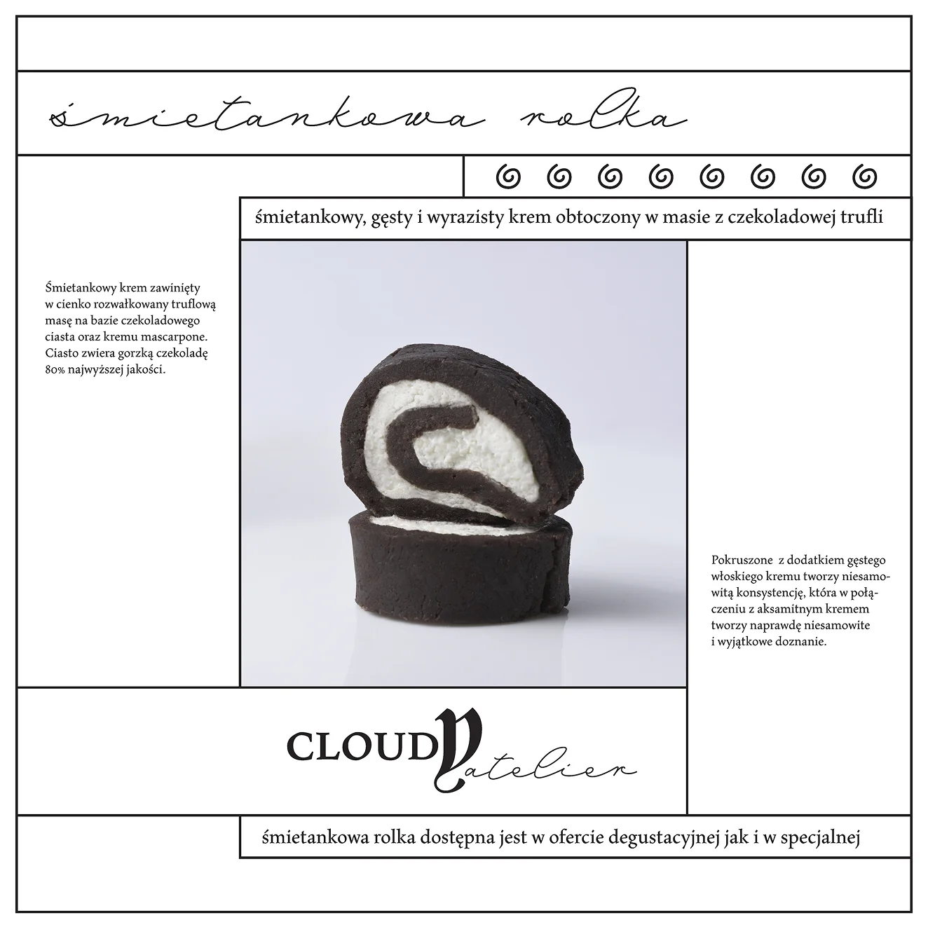
Monochromatyczna paleta kolorystyczna oraz minimalizm podkreślają melancholijny klimat miejsca wraz z wysoką jakością wyrobów cukierniczych jak i baristycznych. Przebywając w nadmorskim atelier można na moment odrzucić codzienny chaos i pęd życia oddając się widokom na morze poruszane bryzą. A owy moment, wcale nie musi być krótki.
ENG
The monochromatic color palette and minimalism emphasize the melancholic atmosphere of the place, along with the high quality of confectionery and barista products. While staying in the seaside atelier, you can momentarily forget the everyday chaos and rush of life, indulging in the views of the sea stirred by the breeze. And that moment does not have to be short.


PL
ENG